Data from the New Zealand Ministry of Health shows that the COVID vaccines have killed over 10 million worldwide

It’s finally here: record-level data showing vaccine timing and death date. There is no confusion any longer: the vaccines are unsafe and have killed, on average, around 1 person per 1,000 doses.
Executive summary
No State or country has ever released record-level public health data on any vaccine.
Privacy is not the reason for this; the data can be easily obfuscated (which we did on this data) so that no record entry would match that of any person, living or dead.
The reason the data is kept secret is simple: it would expose the fact that the COVID vaccines are unsafe, as well as all the vaccines that I have been able to get record-level data on.
Today, thanks to a courageous whistleblower who works at the New Zealand Ministry of Health, we have record-level information from a large population of all ages and are making it public for the first time in history.
Here is the Rumble video announcing the leak:

There was a YouTube link as well, but YouTube censored it within minutes of posting, just like we knew they would.

Just as you suspected, the COVID vaccines have killed millions of people worldwide, an estimated 1 death per 1,000 doses on average in a standard population.
And now we have the data to prove it.
Short responses to criticisms about the data
I posted a link to this section of the doc on X so that people can list any objections I need to counter that aren’t already listed.
Here is are the response points to all the criticisms I’m aware of. The tl;dr is that all of the critiques don’t move the needle.
- I know the leaker and got the data on Nov 9.
- I verified the identity of the leaker and the authenticity of the data and chain of custody.
- There is no doubt about the authenticity. NZMH would have said the data is fake if it was. That would immediately discredit it. But they didn’t because that would be criminal. So they decided to distract people by going after the leaker and calling him a misinformation spreader for leaking the ACTUAL records.
- The data available publicly has been anonymized. That is why they acknowledged this and couldn’t find any matching records. Anyone who thinks their personal data was leaked is delusional.
- There is only one way to analyze this data definitively and that’s with a time-series cohort analysis. This is the exact same methodology the UK ONS used to analyze their vaccine data. The difference is our buckets are one week long so we can see things they are trying to hide. So if you want to dispute the analysis, you either have to show one of 3 things: that 1) our buckets.py program has a bug or 2) that all the mortality curves are flat or relatively flat, or 3) that the dataset is somehow compromised by showing that one of the four graphs is nonsensical or 4) that the v4 xlsx file has a bug in it. Nobody has done #1, and #2 is impossible. Nobody has even attempted #3 or #4. So basically, all the “attacks” are a ridiculous waste of time. There is a way to attack this if it is wrong, but nobody seems capable of figuring it out. I just told you the answer. Go prove I’m wrong using this method and I’m all ears. I did it the professional way just like the UK did. If I made a mistake, tell me what it is. But having each person do their own “ad hoc” analysis is not how you analyze the data. The gold standard is time-series cohort.
- There are 12M doses in New Zealand. The data drop is only for the “Pay per dose” (PPD) program in NZ which is 4M of the 12M records. Whether you got PPD or not is pretty random.
- What cohort does this PPD programme cover? Answer: it’s completely random. It is not age biased or biased to any demographic. If you can prove I’m wrong, show me your data.
- The reason the avg age of death is higher than average is because the older you are, the more the vaccine killed you. Duh.
- KiwiCraig74 wrote: “Yes, these were mobile units used to give vaccinations to people in rest homes, which is where people generally are when they don’t have long left. Average term of residence is only 20 months, so many die within his 10 months (vaccine or no vaccine).” This is just complete bullshit. There are 895,500,935 man days in people under 60 in the data. There are a total of 1,348,440,643 man days in the full data.
- There is a disproportionate amount of records for the doses, i.e., they are not in direct proportion to the total number of each dose, e.g., they are not 33% of each dose. Some doses are over-represented, some are under represented.
- Many people will not have all their doses in this database, e.g., there may just be dose 3 data for someone.
- The fact that the sampling was uneven doesn’t matter if you analyze it the way I did. The fact that doses are missing is also irrelevant. These are gaslighting arguments made by people who are incompetent to analyze this data.
- The data shows a mortality hump that peaks around 6 months after a dose is given.
- If you limit the time period to before COVID, during COVID death wave (from April 1 to August 1, 2022) and after the wave, you find the same response curve. So it wasn’t COVID. People who claim that are misinformed and claim it without evidence.
- Let’s take a simple example. From OWID, we know there were no COVID deaths from Aug 1, 2022 to Nov 1, 2022 in New Zealand. From our spreadsheet we see the average deaths for everyone during that time:
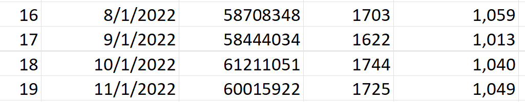
So now lets look at that same period of time, except let’s look relative to the shot administration time
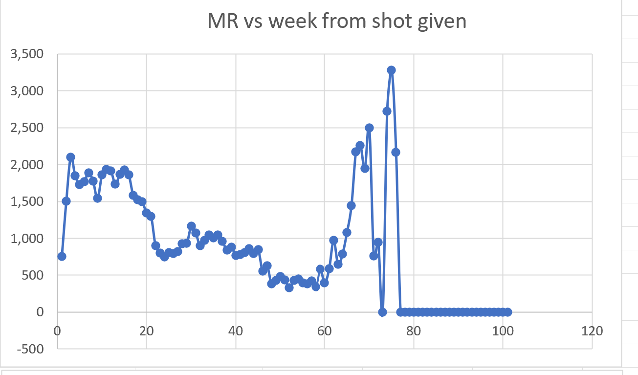
Whoops! Ya got trouble my friend. Right here in River City. With a capital T and that rhymes with V for vaccine. The dots aren’t supposed to go above 1059.
- Nobody will debate me on this. I offered to debate the NZMH epidemiologists about the cohort time-series analysis I did and they don’t want to challenge me for some reason. I can’t figure it out. They should CRUSH me if the data shows the vaccines are safe.
- The NZMH should be releasing the full 12M record dataset to remove all doubt and prove to the world the vaccines are safe. They don’t want to do that. Nobody wants to do that. Nobody in the ##$#$#% world wants to do that. Can you figure out why? Use your brain folks!
- I offered to bet anyone $1M on the same terms as my bet with Saar Wilf that the NZ data is legit and it shows the vaccines increase risk of death. Nobody seems interested in taking my money which means all of them have no confidence whatsoever in their criticisms.
- The NZMH whisteblower, Oracle database admin Barry Young, is a hero. He knew he would risk his life and could spend the rest of his life in jail, but he made the courageous move to expose the data for all to see. This is a highly commendable act of public service. He basically threw the rest of his life away in order to save the lives of others. Why else do you think he would do that? Nobody can explain it.
- They tried to give this to lawmakers but nobody would meet with them.
- No New Zealand lawmaker is calling for an independent investigation. They all want to make Barry into the fall guy. Why not have a worldwide panel of top epidemiologists analyze the record-level data? We know why… Barry was right.
- The NZMH has never released the time-series cohort analysis showing the vaccines are safe. They have never released the record level data. Their goal is to keep the data hidden for as long as possible so that they kill as many people as possible before they are caught. The leadership of NZMH are the people who should be arrested.
- Professor Norman Fenton retracted his remarks about deaths being oversampled after I pointed out to him that there is nothing in the data that supports that. See his new article. He doesn’t dispute my analysis (which ignores the hot lot analysis).
- Igor Chudov wrote a critical article but now is relooking at the data after I talked to him and explained to him how his original article is wrong.
- Jikkyleaks analysis is amazing crude. That’s not the way to analyze this data. I like Jikky but he’s wrong. Once again, nobody would analyze the data that way. There is a right way and a wrong way. The UK ONS got it right. Let’s stick to that way. NOBODY SEEMS TO WANT TO DO IT THE RIGHT WAY. They all want to use their own custom made analysis technique that they create on the seat of their pants, rather than the right way to do that. Why is that?
- UPenn Professor Jeffrey Morris claims you can’t find a signal here but all attempts for a public recorded discussion of the data were refused. He apparently hasn’t even seen my MIT presentation which is a pre-requisite if you are serious about understanding this data. He shoots first without taking the time to listen to what is being presented. Morris isn’t an honest actor. Someone looking to find the truth would be calling for every public health agency to release the record level data. Morris has never made any such call. He doesn’t want the truth exposed. I asked him to explain just one slide in my MIT slide deck (the most devasting slide in the deck), and he hadn’t seen it before which is proof he didn’t even listen to my presentation or even view the slides. Instead of explaining the Medicare data, Morris does his standard “switch the topic” technique to avoid answering a simple question. Click the link and scroll up to see the original question which nobody can answer:
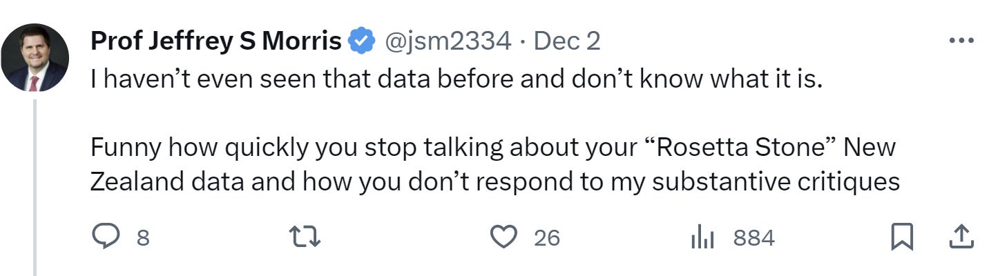
- Morris has had the records in his hands for about 1 week before my MIT talk. He has not published any blog post explaining how this evidence is consistent with a safe vaccine. When I asked him, “So Jeffrey, what exactly would an “unsafe” vaccine look like, he said he doesn’t play games like that. Morris never saw a vaccine that is “unsafe.” In his eyes, no matter how many people die, the vaccine is safe and all safety signals are caused by confounders that he cannot quantify. This is all handwaving analysis to make your point. Where is his blog on this data? I’ll tear it apart inch by inch and show how corrupt he is.
- None of these people who claim to critique this will do a live discussion with me. No offers on the thread at all. If you want to debate me, simply post your argument and follow me, and say you want a debate. Everyone seems scared to do this, including KiwiCraig74.
- The official NZ death records show around 10,000 excess deaths since the vaccines rolled out. This is comparable to the number predicted from the vaccine data (1 excess death per 1,000 doses).


The MIT slide presentation
You can read my “Is it safe?” MIT presentation slides here. I highly recommend reading the slides and/or watching the livestream. I tried to make the slides self-standing, but the livestream can be helpful in explaining some of the slides.
I also periodically dump a PDF version of the presentation to my skirsch.com web server. The PDF version is searchable and you can copy/paste text from it (such as the access keys for the Wasabi server so you can download all the goodies).
The MIT talk livestream links
Here is the Twitter livestream.
Here is the Rumble livestream.
Downloading the data and tools
The MIT presentation listed above has everything you need including the credentials to download all the data.
Here are the credentials:
Server: kirsch.izt.world:9000
Note: do NOT use SSL (make sure this is unchecked)
Public API keys:
access-key= g42m54xwZS80yQpAO20Q
secret-key= Kq77gLL47mbypnnRc0UP7sPTvrvjn6y0D5FSEK5H
You can only access the data-transparency bucket for now. Trust me, there’s more that I’m not disclosing yet (including a new US source other than Medicare).
This bucket has data from New Zealand, US, and the Maldives.
You can use any S3 file browser to download such as CloudBerry Explorer or CyberDuck. Note: you may need to pick one of the default cloud providers, then change the Service point like I did here with CloudBerry Explorer:

Make sure your destination folder is writable when you copy files from the server.
You can also use rclone to make a local copy of the repository on your system:
mysystem% rclone config
mysystem% rclone -sync kirsch:/data-transparency /mylocal/file/destination-dir
Mirror sites (probably not as up to date)
See Kevin McKernan’s tweet which references this folder.

What you will find
- The data: All the data in the data-transparency bucket is sanitized. Any matches to actual records is completely accidental. The data was sanitized in a way that preserves the statistics. We ran the bucket analysis on the original and obfuscated data and got nearly identical results. There is no reason any health authority couldn’t do the same thing we did.
- The tools: We’ll give you our time-series cohort analysis software. This is the software that you’ll never get your State epidemiologist to use. Now, armed with record-level data, you can do your own analysis. We’ve made it super easy to use. When done, paste the output file into our v4 analysis .xlsx spreadsheet and you’ll see instantly whether the vaccine is safe or not.
- The analysis documents: You’ll find annotated spreadsheets as well as word documents.
- The description of the data: You’ll find documents describing the dataset (size, dates, average ages in each cohort, what the authorities claim, etc.
I encourage you to explore. Everything is “legal” in that jurisdiction. So you’ll see the full times of people who died in the Maldives, for example. In other places, the names are omitted.
Introduction
I was provided the data on November 8, 2023 when it was uploaded to my Wasabi file server.
I was asked by the whistleblower to keep the data confidential until November 30 in order to give the whistleblower time to work out the logistics of how the data would be made public.
I honored my commitment and only shared it with a handful of colleagues including Norman Fenton and his associates in the UK with the whistleblower’s consent.
The data from New Zealand is not perfect; it is not a complete sample. For example, for some people, the first record in the database is Dose #3. Also, only vaccinated people are in the database.
But, by using a cohort time-series analysis, it doesn’t matter. There is no possible way that this data is consistent with a safe vaccine. I estimated that the vaccine killed, on average, about 1 person per 1,000 doses. That means an estimated 675,000 Americans were killed by the COVID vaccines.
We have confirmation of the analysis from the US Medicare data thanks to another whistleblower.
The story of the data can be found in my presentation which has a link to the Wasabi server and access credentials, as well as how to download the free Wasabi File Explorers for PC and Mac. There is a large amount of data and analysis uploaded to the servers.
The cohort time-series analysis takes about 2 hours to run on the data. We’ve included the output files so you can start from that.
Analyzing the data takes about 5 minutes using the v4 spreadsheet in the analysis directory. Anyone can do it. You just plug in numbers to vary the parameters to look at anything you want to investigate. It has 8 visualizations: 4 main graphs (one for each independent variable) and 4 below each graph showing the number of deaths so you can use that to judge the reliability of the data points in the graph above.
Be sure to read the entire presentation to understand how to interpret the data.
Papers about the data
Papers will be coming out from various authors over the coming weeks. See this article which I will update over time.
Summary of what we found
Record level vaccination-date/death data obtained from a whistleblower in the New Zealand Ministry of Health was analyzed using a standard time-series cohort analysis. The results remained consistent even after varying all four of the key independent variables (observation time window, days after shot, age, and dose number). The only way that can happen is if the COVID vaccines significantly increased mortality for those aged 60 and older, the very population that the vaccine was supposed to help. All five Bradford Hill causality criteria are satisfied. From this data, we can accurately estimate that overall, the mRNA vaccines led to the premature death of more than 1 person per 1,000 doses on average over all doses.
This estimate is supported by COVID death data from Medicare obtained from another whistleblower. The data from Medicare was stunning: the number of people who died rose monotonically for those who got shot in 2021 or 2022. My whistleblower inside HHS had never seen anything like that before. It was a perfectly straight line sloping upwards for 365 days since the dose was given. A safe vaccine would see a decline in deaths by 4% to 5% after 1 year from the shot. The COVID vaccines had a 26% mortality increase, a net difference of 30%. This makes the COVID vaccine a competitor to heart disease as the leading cause of death among the elderly (which kills 20% of people per year).
The COVID vaccines are the deadliest vaccine of all time, killing an estimated 13 million people worldwide.
The precautionary principle of medicine requires that a vaccine which results in such a large net increase in all-cause mortality should be immediately revoked worldwide unless there is a more likely explanation for this “gold-standard” data. Nobody has come forward with a better explanation that fits all the data. In fact, nobody on the other side even wants to see this data: the FDA, CDC, Moderna, and Pfizer all refused to look at it. How is that responsible? That is reprehensible.
Researchers could have discovered the harms of these vaccines years earlier if any of the world’s health authorities released comparable record-level data to that released here. It is baffling to us why the medical community who is sworn to do no harm is not insisting on seeing any record-level data before recommending the use of any vaccine to their patients. It is the record-level data that is key to understanding whether a vaccine is safe or not. This is always hidden from public view.
Hidden from view?!?!
Clinical outcomes are never improved by keeping public health data hidden from public view. Yet every health authority in the world has kept this critical record-level safety data hidden from view.
And, to our knowledge, only one authority, the UK Office of National Statistics, had supplied even the most basic time-series analysis for a limited amount of time. The UK time-series analysis confirms the monotonic increase in mortality after each shot is given. But the UK ONS got to pick the bucket sizes whereas when we do the analysis, we have buckets for every week so we can see exactly what is going on. They can’t. And the ONS stopped responding to me when I asked to see the record-level data.
Other health authorities apparently refused to analyze their own data themselves to look for any safety signals which we found in abundance just minutes after receiving the data. After we received this data and analyzed this, we reached out to a number of health authorities in the US in Florida, California, and at the CDC and FDA. They all ignored the request to examine the data I obtained or look at their own data. This is the first time in history that vaccination-death record-level data has been made available to the public. And now we know why.
In addition, FOIA requests to the California Department of Public Health showed that they never analyzed their own data. There were no documents showing that they ever looked for any safety signals. They simply trusted the CDC even though the CDC doesn’t have any vaccine record level data, so it is IMPOSSIBLE for the CDC to do the proper safety analysis.
Finally, the safety signals are limited to those 60 and over simply because there wasn’t enough data to make a firm determination for people under 60; the data was simply too noisy because we were only given 4M of the 12M records in New Zealand.
However, since the vaccine provides no benefits whatsoever for infection, hospitalization, or death, there is no reason for anyone in the world to take these vaccines. See the presentation for details.
In any sane world, the COVID vaccines would be immediately halted and inquiries should begin as to why no health authority in the world did a thorough cohort time-series analysis on the data which would have uncovered the safety signal very early in the deployment. Are they all corrupt? Or are they all incompetent? Or both?
Can Moderna survive this? Why would anyone buy their stock?
These results have implications for Moderna stock as the failure of their underlying technology casts serious doubt on their viability as a going concern. Even if governments continue to buy their products, the breach of the public trust and the unwillingness of the company to look at the record-level data shows that the company is more interested in making a profit than ensuring the safety of their customers. A head in the sand approach to safety is despicable.
Pfizer is no different. Both companies were offered an opportunity to view this safety data and they all refused. So did the FDA and CDC. The offer was made by a respected journalist in the medical new community, not by me.
What did Professor Norman Fenton say about this new data?
Nobody should take my word on this. Those are my opinions based on examination of the data.
Anyone can analyze this data. Come to your own conclusions.
Finally, here is what famed British Mathematician Professor Norman Fenton said, “This confirms what we also saw in the most recent ONS data once.
Whatever uncertainty there may be in the younger age groups there is now no doubt the vaccine is increasing the mortality rate in older people.”
I agree. In spades. I’d bet my life on it.
Yale epidemiologist Professor Harvey Risch had this to say:
“I think that you’ve made a very strong case that the Covid genetic vaccines are associated with appreciably increased mortality rates for 6-12 months after each dose. This is particularly compelling in people over age 65. I am not aware of actual evidence that the increased post-vaccine mortality that you’ve shown has a different cause.”
The English translation of what he wrote is “the vaccines are killing people,” but scientists aren’t allowed to be blunt so they have to qualify everything they say.
This is how today’s “scientists” come to conclusions
If there was a mass shooting and everyone died, a scientist would want to have a control group and complete medical histories of each person (including a list of comorbidities) and then want to do a Cox proportional hazards analysis before concluding that the gunman could be the cause of death of these people. Without a control group, the scientist would be unable to say whether the shooting actually caused the deaths.
Nobody with respectable credentials wants to defend the vaccine as being safe
I offered to engage in a public recorded debate with anyone who thinks we got it wrong. Nobody was willing to do that to date, although Professor Jovo Vogelstein offered to give it a try to play devil’s advocate.
If you think we got it wrong, I have a $500K bet pending with Saar Wilf in Israel. I’d love to increase the stakes on that bet. Any takers?
Some people are just never going to figure this out
UPenn Professor Jeffrey Morris has had the data for a while. He doesn’t agree with our analysis (as expected). But when I asked him to explain the Medicare data where the mortality monotonically increases every day for 365 days straight, he said he refused to speculate. Professor Morris never is able to see a vaccine that is unsafe. I proposed all sorts of unsafe hypotheses to him, and he said none of them were convincing. So in his mind, no matter which way the deaths go, even if they go sky high after the vaccine is given, you cannot tell if a vaccine is safe or not; there will always be a confounder that he will find. And he’ll always insist on getting additional data that is never available, so he’ll argue that all data, no matter how strong, is not good enough.
Nearly half of America has already figured out the COVID vaccines are not safe; they want to sue the drug companies!
Fortunately most people figure it out pretty quickly. Did you know that 42% of Americans would join a class action lawsuit against the COVID vax makers if they were allowed under law to do so? That is an unprecedented level of customer dissatisfaction. This is why I shorted Moderna stock. That is not a sustainable business. The markets will eventually figure this out.
Their attempts to gaslight you
Some people will try to convince you that the data isn’t complete and is confounded for that reason. That’s bullshit. If it’s a safe vaccine, you can be missing 99% of the shot data and still get the right answer. Doses don’t matter; a safe vaccine is like a saline shot: they cause no impact.
They won’t get away with stupid arguments like that with me. That’s why they won’t debate me.
Consider supporting my work with a paid subscription
I only have time to do this work because this is my day job.
If you liked this article and want to keep supporting my work, and are not already a paid subscriber, please consider becoming a paid subscriber for just $50/yr or $5/month.
Your subscription fee supports the critical work that Substack has done in providing a free-speech platform, and also provides the funds needed to continue this work to expose the fraud and save lives.
Summary
If you think the vaccines are safe, accept my bet, debate me publicly, or release the record level data in your state. Nobody will do any of those things it seems.
Sooner or later top epidemiologists will weigh in on this data.
Now we’ll see just how broken science is if the world’s top epidemiologists cannot agree that the vaccines are unsafe. For example, will John Ioannidis weigh in? Or will he remain silent? Will Martin Kulldorff say anything? Or will he also ignore this data?
In the meantime, the medical community and mainstream media will keep recommending the jabs as if nothing has happened. They should be ashamed of themselves.
Source: https://kirschsubstack.com/p/data-from-us-medicare-and-the-new?utm_campaign=post